Education
Technical Analysis
Technical analysis can be defined as a discipline for forecasting the direction of prices through the study of past market data. Technical analysis differs from fundamental analysis in that it analyses price, volume and other market information whereas fundamental analysis looks at the actual underlying factors of a currency, company or market.
Technical analysis is comprised of a great many kinds of technical indicators; you can choose those that best suit your trading strategies. We have listed some technical indicators below which can be found on our trading platform.
Accelerator/Decelerator Oscillator (AC)
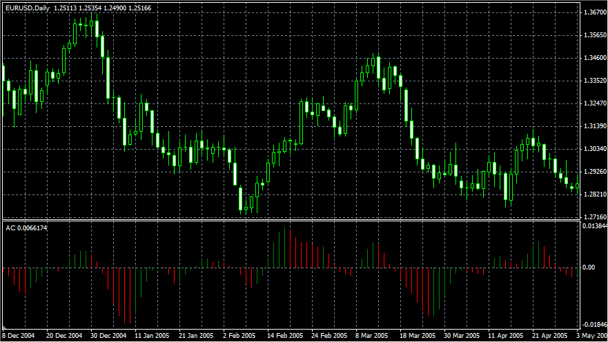
Accelerator/Decelerator Oscillator measures acceleration and deceleration of the current driving force. This indicator will change direction before any changes in the driving force, which, in its turn, will change its direction before the price. If you realize that Acceleration/Deceleration is a signal of an earlier warning, it gives you evident advantages.
The zero line is basically the spot where the driving force is at an equilibrium point. If Accelerator/Decelerator is higher than zero, then it is usually easier for the acceleration to continue the upward movement (and vice versa in cases when it is below zero). Unlike the Awesome Oscillator, it is generally not recommended to enter a position when the histogram crosses the zero line or when the colour of the bar changes. Rather, it can be used in conjunction with other indicators like Awesome Oscillator or Parabolic SARS as a measure of confidence in direction.
Accumulation/Distribution
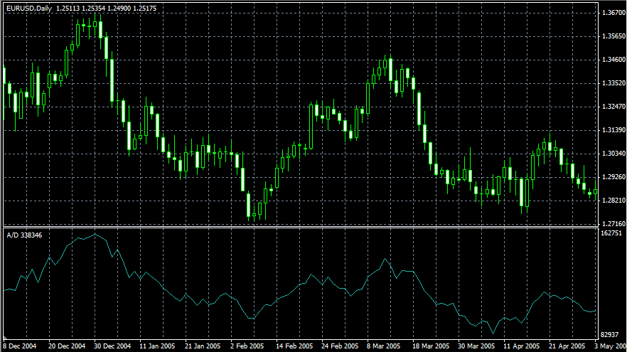
Accumulation/Distribution Technical Indicator is determined by the changes in price and volume. The volume acts as a weighting coefficient at the change of price -- the higher the coefficient (the volume) is, the greater the contribution of the price change (for this period of time) will be in the value of the indicator.
In fact, this indicator is a variant of the more commonly used indicator On Balance Volume. They are both used to confirm price changes by means of measuring the respective volume of sales.
When the Accumulation/Distribution indicator grows, it means accumulation (buying) of a particular security, as the overwhelming share of the sales volume is related to an upward trend of prices. When the indicator drops, it means distribution (selling) of the security, as most of sales take place during the downward price movement.
Divergences between the Accumulation/Distribution indicator and the price of the security indicate the upcoming change of prices. As a rule, in case of such divergences, the price tendency moves in the direction in which the indicator moves. Thus, if the indicator is growing, and the price of the security is dropping, a turnaround of price should be expected.
Alligator
The developer of Alligator says: "Most of the time the market remains stationary. Only for some 15-30% of time the market generates trends, and traders who are not located in the exchange itself derive most of their profits from the trends. My Grandfather used to repeat: "Even a blind chicken will find its corns, if it is always fed at the same time". We call the trade on the trend "a blind chicken market". It took us years, but we have produced an indicator, that lets us always keep our powder dry until we reach the blind chicken market"
In principle, Alligator Technical Indicator is a combination of Balance Lines (Moving Averages) that use fractal geometry and nonlinear dynamics.
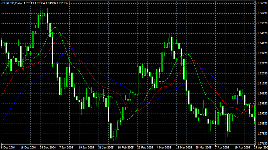
・ The blue line (Alligator's Jaw) is the Balance Line for the timeframe that was used to build the chart (13-period Smoothed Moving Average, moved into the future by 8 bars);
・ The red line (Alligator's Teeth) is the Balance Line for the value timeframe of one level lower (8-period Smoothed Moving Average, moved by 5 bars into the future);
・ The green line (Alligator's Lips) is the Balance Line for the value timeframe, one more level lower (5-period Smoothed Moving Average, moved by 3 bars into the future).
Lips, Teeth and Jaw of the Alligator show the interaction of different time periods. As clear trends can be seen only 15 to 30 per cent of the time, it is essential to follow them and refrain from working on markets that fluctuate only within certain price periods.
When the Jaw, the Teeth and the Lips are closed or intertwined, it means the Alligator is going to sleep or is asleep already. As it sleeps, it gets hungrier and hungrier -- the longer it will sleep, the hungrier it will wake up. The first thing it does after it wakes up is to open its mouth and yawn. Then the smell of food comes to its nostrils: flesh of a bull or flesh of a bear, and the Alligator starts to hunt it. Having eaten enough to feel quite full, the Alligator starts to lose the interest to the food/price (Balance Lines join together) -- this is the time to fix the profit.
Average Directional Movement Index (ADX)
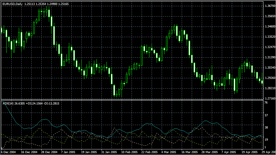
Average Directional Movement Index Technical Indicator (ADX) is used to measure the strength or weakness of a trend, not the actual direction. It was developed and described in detail by Welles Wilder in his book "New concepts in technical trading systems".
Wilder created a simple system for trading. First that ADX traded above 25 (which determined a trend). A buy signal is created when +DI crosses above -DI. A sell signal triggers when -DI crosses above +DI
To these simple commercial rules Wells Wilder added "a rule of points of extremum". It is used to eliminate false signals and decrease the number of deals. According to the principle of points of extremum, the "point of extremum" is the point when +DI and -DI cross each other. If +DI raises higher than -DI, this point will be the maximum price of the day when they cross. If +DI is lower than -DI, this point will be the minimum price of the day they cross.
The point of extremum is used then as the market entry level. Thus, after the signal to buy (+DI is higher than -DI) one must wait till the price has exceeded the point of extremum, and only then buy. However, if the price fails to exceed the level of the point of extremum, one should retain the short position.
Average True Range (ATR)
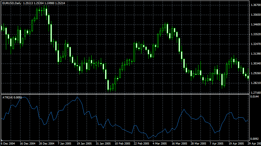
Average True Range Technical Indicator (ATR) is an indicator that shows volatility of the market. It was introduced by Welles Wilder in his book "New concepts in technical trading systems". This indicator has been used as a component of numerous other indicators and trading systems ever since.
Average True Range can often reach a high value at the bottom of the market after a sheer fall in prices occasioned by panic selling. Low values of the indicator are typical for the periods of sideways movement of long duration which happen at the top of the market and during consolidation. Average True Range can be interpreted according to the same principles as other volatility indicators. The principle of forecasting based on this indicator can be worded the following way: the higher the value of the indicator, the higher the probability of a trend change; the lower the indicator's value, the weaker the trend's movement is.
Awesome Oscillator
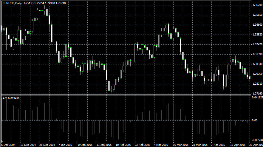
Awesome Oscillator Technical Indicator (AO) is a 34-period simple moving average, plotted through the middle points of the bars (H+L)/2, which is subtracted from the 5-period simple moving average, built across the central points of the bars (H+L)/2. It shows us quite clearly what's happening to the market driving force at the present moment.
Signals to buy
Saucer
This is the only signal to buy that comes when the bar chart is higher than the zero line. One must bear in mind:
・ the saucer signal is generated when the bar chart reverses direction from the downward to upward. The second column is lower than the first one and is colored red. The third column is higher than the second and is colored green.
・ for the saucer signal to be generated the bar chart should have at least three columns.
Keep in mind that all Awesome Oscillator columns should be over the zero line for the saucer signal to be used.
Zero line crossing
The signal to buy is generated when the bar chart passes from the area of negative values to that of positive. It comes when the bar chart crosses the zero line. As regards this signal:
・ for this signal to be generated, only two columns are necessary;
・ the first column is to be below the zero line, the second one is to cross it (transition from a negative value to a positive one);
・ simultaneous generation of signals to buy and to sell is impossible.
Two pikes
This is the only signal to buy that can be generated when the bar chart values are below the zero line. As regards this signal, please, bear in mind:
・ another by followed is and line zero the below which minimum lowest (the down pointing pike a have you when generated signal the down-pointing) pike which is somewhat higher (a negative figure with a lesser absolute value, which is therefore closer to the zero line), than the previous down-looking pike.
・ the bar chart is to be below the zero line between the two pikes. If the bar chart crosses the zero line in the section between the pikes, the signal to buy doesn't function. However, a different signal to buy will be generated -- zero line crossing. each new pike of the bar chart is to be higher (a negative number of a lesser absolute value that is closer to the zero line) than the previous pike.
・ if an additional higher pike is formed (that is closer to the zero line) and the bar chart has not crossed the zero line, an additional signal to buy will be generated.
Signals to sell
Awesome Oscillator signals to sell are identical to the signals to buy. The saucer signal is reversed and is below zero. Zero line crossing is on the decrease -- the first column of it is over the zero, the second one is under it. The two pikes signal is higher than the zero line and is reversed too.
Bears Power
Everyday trading represents a battle of buyers ("Bulls") pushing prices up and sellers ("Bears") pushing prices down. Depending on what party scores off, the day will end with a price that is higher or lower than that of the previous day. Intermediate results, first of all, the highest and lowest price, allow you to judge how the battle developed during the day.
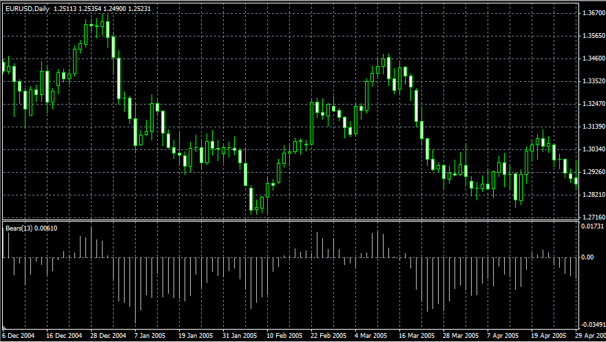
It is very important to be able to estimate the Bears Power balance since changes in this balance initially signal possible trend reversals. This task can be solved using the Bears Power oscillator developed by Alexander Elder and described in his book titled Trading for a Living. Elder used the following premises when constructing this oscillator:
・ moving average is a price agreement between sellers and buyers for a certain period of time,
・ the lowest price displays the maximum sellers' power within the day.
On these premises, Elder developed Bears Power as the difference between the lowest price and 13-period exponential moving average (LOW - EMA).
Application
This indicator is better to use together with a trend indicator (most frequently Moving Average):
・ if trend indicator is up-directed and the Bears Power index is below zero, but growing, it is a signal to buy;
・ it is desirable that, in this case, the divergence of bases were being formed in the indicator chart.
Bollinger Bands (BB)
Bollinger Bands Technical Indicator (BB) is similar to Envelopes. The only difference is that the bands of Envelopes are plotted at a fixed distance (%) away from the moving average, while the Bollinger Bands are plotted at a certain number of standard deviations away from it. Standard deviation is a measure of volatility. Therefore Bollinger Bands adjust themselves to the market conditions. When the markets become more volatile, the bands widen and they contract during less volatile periods.
Bollinger Bands are usually plotted on the price chart, but they can be also added to the indicator chart (Custom Indicators). As with Envelopes, the interpretation of Bollinger Bands is based on the fact that price activity tends to remain in between the top and the bottom line of the bands. A distinctive feature of the Bollinger Band indicator is its variable width due to the volatility of prices. In periods of high volatility the bands widen leaving a lot of room for the prices to move in. During periods of low volatility the bands contract, keeping the prices within their limits.
The following traits are particular to the Bollinger Band:
1. abrupt changes in prices tend to happen after the band has contracted due to decrease of volatility.
2. if prices break through the upper band, a continuation of the current trend can be expected.
3. if the pikes and hollows outside the band are followed by pikes and hollows inside the band, a reverse of trend may occur.
4. the price movement that has started from one of the band's lines usually reaches the opposite one. This last observation is useful for forecasting price guideposts.

Bulls Power
Everyday trading represents a battle of buyers ("Bulls") pushing prices up and sellers ("Bears") pushing prices down. Depending on what party scores off, the day will end with a price that is higher or lower than that of the previous day. Intermediate results, first of all, the highest and lowest price, allow you to judge about how the battle developed during the day.
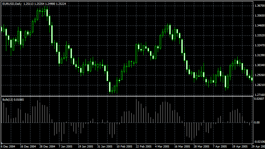
It is very important to be able to estimate the Bears Power balance since changes in this balance initially signal possible trend reversals. This task can be solved using the Bulls Power oscillator developed by Alexander Elder and described in his book titled Trading for a Living. Elder based the following premises when constructing this oscillator:
moving average is a price agreement between sellers and buyers for a certain period of time,
the highest price displays the maximum buyers' power within the day.
On these premises, Elder developed Bulls Power as the difference between the highest price and 13-period exponential moving average (HIGH - EMA).
Application
This indicator can be used with a trend indicator (most frequently used is an Exponential Moving Average, 13 period):
Buy if:
・ there is an increasing trend (determined with the Exponential Moving Average movement);
・ the Bears Power oscillator is negative, but increasing at the same time;
・ the last peak of the Bulls Power oscillator is higher than the previous one;
・ the Bears Power oscillator increases after the Bulls divergence.
At the positive values of the Bears Power oscillator, it is better to keep back.
Sell if:
・ there is a decreasing trend (determined with the Exponential Moving Average movement);
・ the Bulls Power oscillator is positive, but decreases gradually;
・ the last trough of the Bulls Power oscillator is lower than the previous one;
・ the Bulls Power oscillator decreases leaving the Bears' divergence.
Do not open short positions when the Bulls Power oscillator is negative. Divergence between the Bulls and Bears Power and prices is the best time for trading.
Commodity Channel Index (CCI)
Commodity Channel Index Technical Indicator (CCI) measures the deviation of the commodity price from its average statistical price. High values of the index indicate that the price is unusually high in comparison with the average price, while low values indicate that the price is too low. In spite of its name, the Commodity Channel Index can be applied for any financial instrument.
There are two basic techniques when using the Commodity Channel Index:
1. Finding the divergences
The divergence appears when the price reaches a new maximum, and Commodity Channel Index cannot grow above the previous maximums. This classical divergence is normally followed by a price correction.
2. As an indicator of overbuying/overselling
Commodity Channel Index usually varies in the range of ±100. Values above +100 indicate an overbought state (and a probability of a correction to more representative levels), and the values below 100 indicate an oversold state (and the probability of a correction to more representative levels).

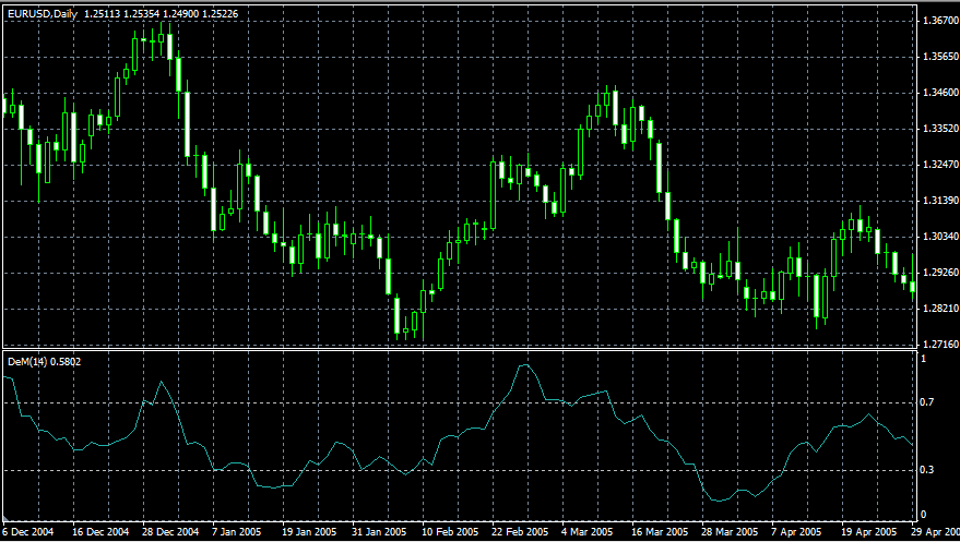
DeMarker
Demarker Technical Indicator is based on the comparison of the period maximum with the previous period maximum. If the current period (bar) maximum is higher, the respective difference between the two will be registered. If the current maximum is lower or equaling the maximum of the previous period, the naught value will be registered. The differences received for N periods are then summarized. The received value is used as the numerator of the DeMarker and will be divided by the same value plus the sum of differences between the price minima of the previous and the current periods (bars). If the current price minimum is greater than that of the previous bar, the naught value will be registered.
When the indicator falls below 30, the bullish price reversal should be expected. When the indicator rises above 70, the bearish price reversal should be expected.
If you use periods of longer duration, when calculating the indicator, you'll be able to catch the long term market tendency. Indicators based on short periods let you enter the market at the point of the least risk and plan the time of transaction so that it falls in with the major trend. Unlike many other oscillators, it does not use smoothed data.
Envelopes
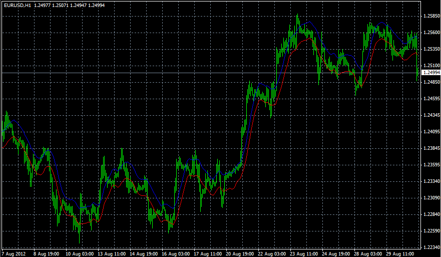
Envelopes Technical Indicator is formed with two Moving Averages one of which is shifted upward and another one is shifted downward. The selection of optimum relative number of band margins shifting is determined with the market volatility: the higher the latter is, the stronger the shift is.
Envelopes define the upper and the lower margins of the price range. Signal to sell appears when the price reaches the upper margin of the band; signal to buy appears when the price reaches the lower margin.
The logic behind envelopes is that overzealous buyers and sellers push the price to the extremes (i.e., the upper and lower bands), at which point the prices often stabilize by moving to more realistic levels. This is similar to the interpretation of Bollinger Bands.
Force Index
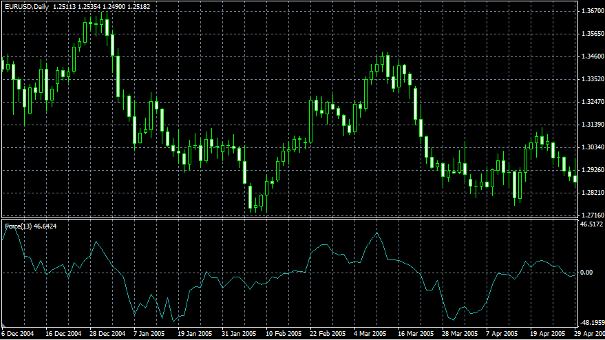
Force Index Technical Indicator was developed by Alexander Elder. It is an indicator that uses price and volume to assess the power behind a move or identify possible turning points. According to Elder there are three basic elements to price movement: direction, extent and volume. This index can be used with a Moving Average to reinforce overall trend, corrections or reversals.
Fractals
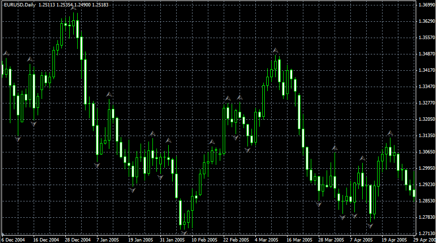
All markets are characterized by the fact that on the most part the prices do not change too much, and only short periods of time (15-30 percent) account for trend changes. Potential trading opportunities arise when market prices change according to a certain trend.
A Fractal is one of five indicators of Bill Williams' trading system, which tries to detect the bottom or the top (or what can be the beginning of a new trend).
The basic Fractal is composed of five or more bars. The rules for identifying a Fractal are:
・ A bearing turning point occurs when there is a pattern with the highest high in the middle and two lower highs on either side.
・ A bullish turning point occurs when there is a pattern with the lowest low in the middle and two higher lows on either side
The fractal can be filtered with the use of an Alligator. In other words, you should not close a buy transaction, if the fractal is lower than the Alligator's Teeth, and you should not close a sell transaction, if the fractal is higher than the Alligator's Teeth. After the Fractal signal has been created and is in force, which is determined by its position beyond the Alligator's Mouth, it remains a signal until it gets attacked, or until a more recent Fractal signal emerges.
Gator Oscillator
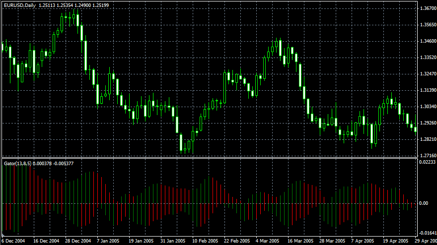
Gator Oscillator is based on the Alligator and shows the degree of convergence/divergence of the Balance Lines (Smoothed Moving Averages). The top bar chart is the absolute difference between the values of the blue and the red lines. The bottom bar chart is the absolute difference between the values of the red line and the green line, but with the minus sign, as the bar chart is drawn top-down.
Ichimoku Kinko Hyo
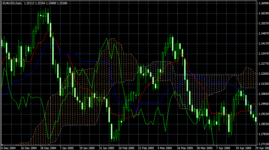
Ichimoku Kinko Hyo Technical Indicator is predefined to characterize the market Trend, Support and Resistance Levels, and to generate signals of buying and selling. This indicator works best on weekly and daily charts.
When defining the dimension of parameters, four time intervals of different length are used. The values of individual lines comprising this indicator are based on the following intervals:
・ Tenkan-sen shows the average price value during the first time interval defined as the sum of maximum and minimum within this time, divided by two;
・ Kijun-sen shows the average price value during the second time interval;
・ Senkou Span A shows the middle of the distance between two previous lines shifted forwards by the value of the second time interval;
・ Senkou Span B shows the average price value during the third time interval shifted forwards by the value of the second time interval.
・ Chinkou Span shows the closing price of the current candle shifted backwards by the value of the second time interval.
The distance between the Senkou lines is used with another color and called "cloud". If the price is between these lines, the market should be considered as non-trend, and then the cloud margins form the support and resistance levels:
・ If the price is above the cloud, its upper line forms the first support level, and the second line forms the second support level;
・ If the price is below cloud, the lower line forms the first resistance level, and the upper one forms the second level;
・ If the Chinkou Span line traverses the price chart in the bottom-up direction it is a signal to buy. If the Chinkou Span line traverses the price chart in the top-down direction it is a signal to sell.
Kijun-sen is used as an indicator of market movement. If the price is higher than this indicator, the price will probably continue to increase. When the price traverses this line then further trend changing is possible.
Another method using the Kijun-sen is giving signals. Signal to buy is generated when the Tenkan-sen line traverses the Kijun-sen in the bottom-up direction. Top-down direction is the signal to sell.
Tenkan-sen is used as an indicator of the market trend. If this line increases or decreases, the trend exists. When it goes horizontally, it means that the market has come into the channel.
Market Facilitation Index
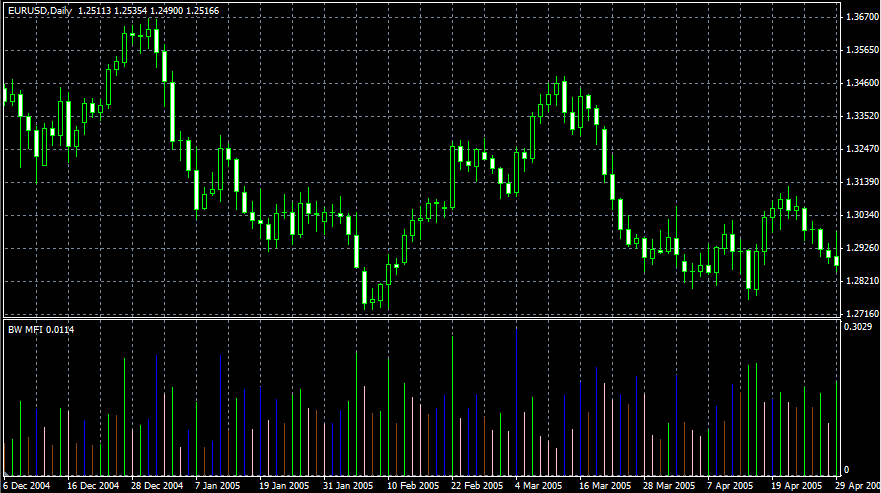
Market Facilitation Index Technical Indicator (BW MFI) is an indicator which shows the change of price for one tick. Absolute values of the indicator do not mean anything as they are, only indicator changes have sense. Bill Williams emphasizes the interchanging of MFI and volume:
Market Facilitation Index increases and volume increases -- this points out that: a) the number of players coming into the market increases (volume increases) b) the new coming players open positions in the direction of bar development, i.e., the movement has begun and picks up speed;
Market Facilitation Index falls and volume falls. It means the market participants are not interested anymore;
Market Facilitation Index increases, but the volume falls. It is most likely, that the market is not supported with the volume from clients, and the price is changing due to traders' (brokers and dealers) "on the floor" speculations;
Market Facilitation Index falls, but the volume increases. There is a battle between bulls and bears, characterized by a large sell and buy volume, but the price is not changing significantly since the forces are equal. One of the contending parties (buyers vs. sellers) will eventually win the battle. Usually, the break of such a bar lets you know if this bar determines the continuation of the trend or annuls the trend. Bill Williams calls such a bar "curtsying".
Momentum
The Momentum Technical Indicator measures the amount that a security's price has changed over a given time span.
There are basically two ways to use the Momentum indicator:
You can use the Momentum indicator as a trend-following oscillator similar to the Moving Average Convergence/Divergence (MACD). Buy when the indicator bottoms and turns up and sell when the indicator peaks and turns down. You may want to plot a short-term moving average of the indicator to determine when it is bottoming or peaking.
If the Momentum indicator reaches extremely high or low values (relative to its historical values) you should assume a continuation of the current trend. For example, if the Momentum indicator reaches extremely high values and then turns down, you should assume prices will probably go still higher. In either case, only trade after prices confirm the signal generated by the indicator (for example, if prices peak and turn down, wait for prices to begin to fall before selling).
You can also use the Momentum indicator as a leading indicator. This method assumes that market tops are typically identified by a rapid price increase (when everyone expects prices to go higher) and that market bottoms typically end with rapid price declines (when everyone wants to get out). This is often the case, but it is also a broad generalization.
As a market peaks, the Momentum indicator will climb sharply and then fall off -- diverging from the continued upward or sideways movement of the price. Similarly, at a market bottom, Momentum will drop sharply and then begin to climb well ahead of prices. Both of these situations result in divergences between the indicator and prices.

Money Flow Index
Money Flow Index (MFI) is the technical indicator, which indicates the rate at which money is invested into a security and then withdrawn from it. Construction and interpretation of the indicator is similar to Relative Strength Index with the only difference that volume is important to MFI.
When analyzing the money flow index one needs to take into consideration the following points:
・ divergences between the indicator and price movement. If prices grow while MFI falls (or vice versa), there is a great probability of a price turn;
・ Money Flow Index value, which is over 80 or under 20, signals correspondingly of a potential peak or bottom of the market.

Moving Average
The Moving Average Technical Indicator shows the mean instrument price value for a certain period of time. When one calculates the moving average, one averages out the instrument price for this time period. As the price changes, its moving average either increases, or decreases.
There are four different types of moving average: Simple (also referred to as Arithmetic), Exponential, Smoothed and Linear Weighted. Moving averages may be calculated for any sequential data set, including opening and closing prices, highest and lowest prices, trading volume or any other indicators. It is often the case when double moving averages are used.
The only thing where moving averages of different types diverge considerably from each other is when weight coefficients, which are assigned to the latest data, are different. In case we are talking of simple moving average, all prices of the time period in question, are equal in value. Exponential and Linear Weighted Moving Averages attach more value to the latest prices.
The most common way to interpreting a moving average is to compare its dynamics to the price action. When the instrument price rises above its moving average, a buy signal appears. If the price falls below its moving average a sell signal may be produced.
This trading system, which is based on the moving average, is not designed to provide entrance into the market right at its lowest point and exit right at the peak. It allows one to act according to the following trend: to buy soon after the prices reach the bottom, and to sell soon after the prices have reached their peak.
Moving averages may also be applied to indicators. That is where the interpretation of indicator moving averages is similar to the interpretation of price moving averages: if the indicator rises above its moving average, that means that the ascending indicator movement is likely to continue: if the indicator falls below its moving average, this means that it is likely to continue going downward.
Below are the types of moving averages on the chart:
・ Simple Moving Average (SMA)
・ Exponential Moving Average (EMA)
・ Smoothed Moving Average (SMMA)
・ Linear Weighted Moving Average (LWMA)

Moving Average Convergence/Divergence (MACD)
Moving Average Convergence/Divergence (MACD) is a trend-following dynamic indicator. It indicates the correlation between two price moving averages.
The MACD is the difference between two different (slow and fast) period Exponential Moving Averages (EMA). In order to clearly show buy/sell opportunities, a so-called signal line (a defined period indicator's moving average) is plotted on the MACD chart.
The MACD proves most effective in wide-swinging trading markets. There are three popular ways to use the MACD: crossovers, overbought/oversold conditions, and divergences.
Crossovers
The basic MACD trading rule is to sell when the MACD falls below its signal line. Similarly, a buy signal occurs when the MACD rises above its signal line. It is also popular to buy/sell when the MACD goes above/below zero.
Overbought/oversold conditions
The MACD is also useful as an overbought/oversold indicator. When the shorter moving average pulls away dramatically from the longer moving average (i.e., the MACD rises), it is likely that the security price is overextending and will soon return to more realistic levels.
Divergence
An indication that an end to the current trend may be near occurs when the MACD diverges from the security. A bullish divergence occurs when the Moving Average Convergence/Divergence indicator is making new highs while prices fail to reach new highs. A bearish divergence occurs when the MACD is making new lows while prices fail to reach new lows. Both of these divergences are most significant when they occur at relatively overbought/oversold levels.
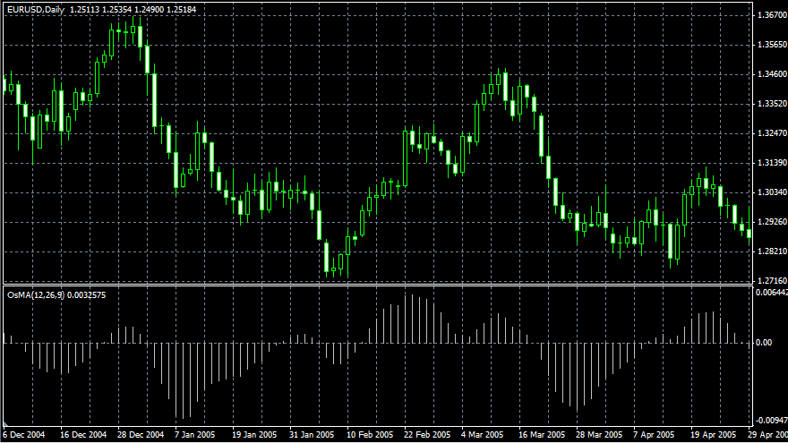
Moving Average of Oscillator
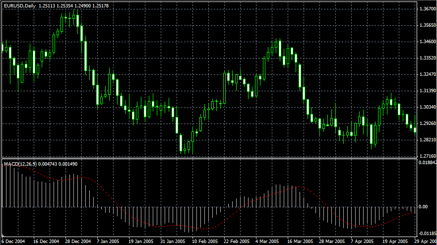
Moving Average of Oscillator is the difference between the oscillator and oscillator smoothing. In this case, the Moving Average Convergence/Divergence base-line is used as the oscillator, and the signal line is used as the smoothing.
On Balance Volume (OBV)
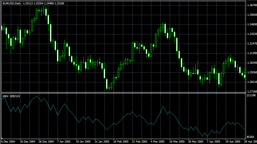
On Balance Volume Technical Indicator (OBV) is a momentum technical indicator that relates volume to price change. The indicator, which Joseph Granville came up with, is pretty simple. When the security closes higher than the previous close, all of the day's volume is considered up-volume. When the security closes lower than the previous close, all of the day's volume is considered down-volume.
The basic assumption, regarding On Balance Volume analysis, is that OBV changes precede price changes. The theory is that smart money can be seen flowing into the security by a rising OBV. When the public then moves into the security, both the security and the On Balance Volume will surge ahead.
If the security's price movement precedes OBV movement, a "non-confirmation" has occurred. Non-confirmations can occur at bull market tops (when the security rises without, or before, the OBV) or at bear market bottoms (when the security falls without, or before, the On Balance Volume Technical Indicator).
The OBV is in a rising trend when each new peak is higher than the previous peak and each new trough is higher than the previous trough. Likewise, the On Balance Volume is in a falling trend when each successive peak is lower than the previous peak and each successive trough is lower than the previous trough. When the OBV is moving sideways and is not making successive highs and lows, it is in a doubtful trend.
Once a trend is established, it remains in force until it is broken. There are two ways in which the On Balance Volume trend can be broken. The first occurs when the trend changes from a rising trend to a falling trend, or from a falling trend to a rising trend.
The second way the OBV trend can be broken is if the trend changes to a doubtful trend and remains doubtful for more than three days. Thus, if the security changes from a rising trend to a doubtful trend and remains doubtful for only two days before changing back to a rising trend, the On Balance Volume is considered to have always been in a rising trend.
When the OBV changes to a rising or falling trend, a "breakout" has occurred. Since OBV breakouts normally precede price breakouts, investors should buy long on On Balance Volume upside breakouts. Likewise, investors should sell short when the OBV makes a downside breakout. Positions should be held until the trend changes.
Parabolic SAR
Parabolic SAR Technical Indicator was developed for analyzing trending markets. The indicator is constructed on the price chart. This indicator is similar to the Moving Average Technical Indicator with the only difference that Parabolic SAR moves with higher acceleration and may change its position in terms of the price. The indicator is below the prices on a bull market (Up Trend) and above the prices when it is bearish (Down Trend).
If the price crosses the Parabolic SAR lines, the indicator turns, and its further values are situated on the other side of the price. When such an indicator turn does take place, the maximum or the minimum price for the previous period would serve as the starting point. When the indicator makes a turn, it gives a signal of the trend end (correction stage or flat), or of its turn.
The Parabolic SAR is an outstanding indicator for providing exit points. Long positions should be closed when the price sinks below the SAR line, short positions should be closed when the price rises above the SAR line. It is often the case that the indicator serves as a trailing stop line.
If the long position is open (i.e., the price is above the SAR line), the Parabolic SAR line will go up, regardless of what direction the prices take. The length of the SAR line movement depends on the scale of the price movement.

Relative Strength Index
The Relative Strength Index Technical Indicator (RSI) is a price-following oscillator that ranges between 0 and 100. When Wilder introduced the Relative Strength Index, he recommended using a 14-day RSI. Since then, the 9-day and 25-day Relative Strength Index indicators have also gained popularity.
A popular method of analyzing the RSI is to look for a divergence in which the security is making a new high, but the RSI is failing to surpass its previous high. This divergence is an indication of an impending reversal. When the Relative Strength Index then turns down and falls below its most recent trough, it is said to have completed a "failure swing". The failure swing is considered a confirmation of the impending reversal.
Ways to use Relative Strength Index for chart analysis:
・ Tops and bottoms
The Relative Strength Index usually tops above 70 and bottoms below 30. It usually forms these tops and bottoms before the underlying price chart;
・ Chart Formations
The RSI often forms chart patterns such as head and shoulders or triangles that may or may not be visible on the price chart;
・ Failure swing ( Support or Resistance penetrations or breakouts)
This is where the Relative Strength Index surpasses a previous high (peak) or falls below a recent low (trough);
・ Support and Resistance levels
The Relative Strength Index shows, sometimes more clearly than price themselves, levels of support and resistance.
・ Divergences
As discussed above, divergences occur when the price makes a new high (or low) that is not confirmed by a new high (or low) in the Relative Strength Index. Prices usually correct and move in the direction of the RSI.

Relative Vigor Index (RVI)
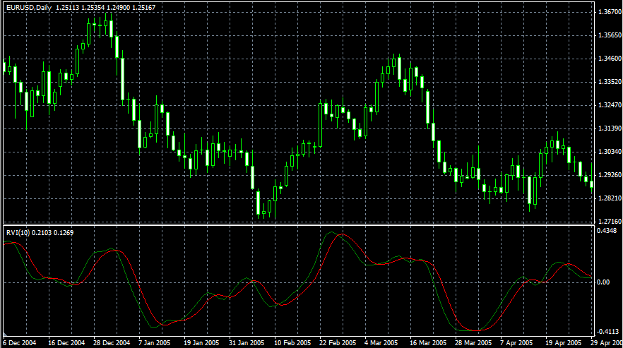
The main point of Relative Vigor Index Technical Indicator (RVI) is that on the bull market the closing price is, as a rule, higher, than the opening price. It is the other way round on the bear market. So the idea behind Relative Vigor Index is that the vigor, or energy, of the move is thus established by where the prices end up at the close. To normalize the index to the daily trading range, divide the change of price by the maximum range of prices for the day. To make a more smooth calculation, one uses Simple Moving Average. 10 is the best period. To avoid probable ambiguity one needs to construct a signal line, which is a 4-period symmetrically weighted moving average of Relative Vigor Index values. The concurrence of lines serves as a signal to buy or to sell.
Standard Deviation (StdDev)
Technical indicator named Standard Deviation (StdDev) measures the market volatility. This indicator characterizes the scale of price changes relating to the Moving Average. Thus, if the indicator value is large, the market is volatile and the bar prices are rather dispersed relating to the moving average. If the indicator value is not large, it means that the market volatility is low and the bar prices are rather close to the moving average.
Normally, this indicator is used as a constituent of other indicators. Thus, when Bollinger Bands is calculated, the value of the symbol standard deviation is added to its Moving Average.
The market behavior represents the interchange of high trading activity and a languid market. So, the indicator can be interpreted easily:
・ if its value is too low, i.e., the market is absolutely inactive, it makes sense to expect a spike soon;
・ otherwise, if it is extremely high, it most probably means that activity will decline soon.

Stochastic Oscillator
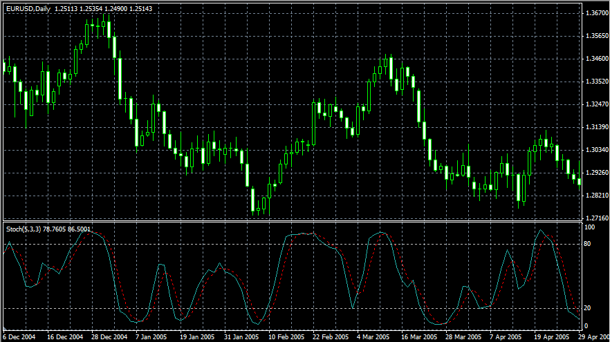
The Stochastic Oscillator Technical Indicator compares where a security's price closed relative to its price range over a given time period. The Stochastic Oscillator is displayed as two lines. The main line is called %K. The second line, called %D, is a Moving Average of %K. The %K line is usually displayed as a solid line and the %D line is usually displayed as a dotted line.
There are several ways to interpret a Stochastic Oscillator. Three popular methods include:
・ Buy when the Oscillator (either %K or %D) falls below a specific level (e.g., 20) and then rises above that level. Sell when the Oscillator rises above a specific level (e.g., 80) and then falls below that level;
・ Buy when the %K line rises above the %D line and sell when the %K line falls below the %D line;
・ Look for divergences. For instance: where prices are making a series of new highs and the Stochastic Oscillator is failing to surpass its previous highs.
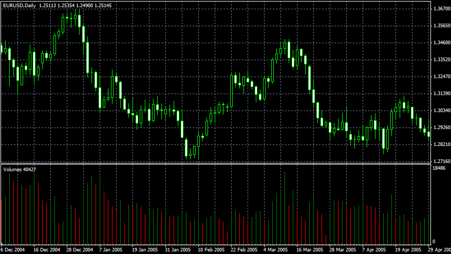
Volumes
A volume indicator which tries to gauge supply and demand for a currency pair by discovering if investors are generally "Accumulating" (buying) or "Distributing" (selling) the pair. The basic premise has always been that volume (or money flow) may be a leading indicator to price action.
Williams’ Percent Range (%R)
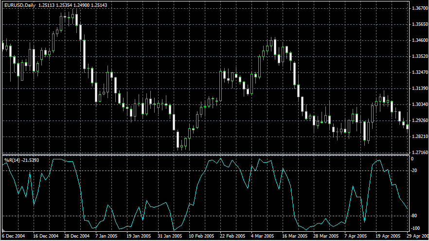
Williams' Percent Range Technical Indicator (%R) is a dynamic technical indicator, which determines whether the market is overbought/oversold. Williams' %R is very similar to the Stochastic Oscillator. The only difference is that %R has an upside down scale and the Stochastic Oscillator has internal smoothing.
To show the indicator in this upside down fashion, one places a minus symbol before the Williams Percent Range values (for example -30%). One should ignore the minus symbol when conducting the analysis.
Indicator values ranging between 80 and 100% indicate that the market is oversold. Indicator values ranging between 0 and 20% indicate that the market is overbought.
As with all overbought/oversold indicators, it is best to wait for the security's price to change direction before placing your trades. For example, if an overbought/oversold indicator is showing an overbought condition, it is wise to wait for the security's price to turn down before selling the security.
An interesting phenomenon of the Williams Percent Range indicator is its uncanny ability to anticipate a reversal in the underlying security's price. The indicator almost always forms a peak and turns down a few days before the security's price peaks and turns down. Likewise, Williams Percent Range usually creates a trough and turns up a few days before the security's price turns up.

 My Hirose Login


